Thursday, 5 December 2013

Evaluation- Question Five

What elements of your text would attract
the target audience?


Evaluation question five from Lucy Trigger on Vimeo.


At the start of my media text I show my main character standing at her dressing table and getting ready by putting on makeup, this element will appeal to my target audience specifically because teenagers especially teenage girls are very interested in makeup and getting ready to go somewhere which so far in the opening of my film, the audience aren't aware where she is going. I chose my main character to have quite casual makeup but made sure it was noticeable to attract my target audience as females will be interested in the makeup specifically where as males may be attracted to my character because of what she looks like and find her attractive because of the makeup.


The costume I chose for my main character attracts my target audience because its very causal but still looks good. I think it makes my character look like a nice person because her clothes are similar to what a stereotypical teenage girl would wear therefore other teenagers could relate to her and maybe want to be like her. The clothes look casual but also look attractive which would attract both teenage girls and boys because girls may want to look like her and a boy may be attracted to her looks and personality.


The representation of my main character would attract my target audience because it shows a positive representation of teenagers. It shows she is respectful because she is dressed appropriately and does not act inappropriately for example she does not swear. Also it shows a positive representation of teens because at the start of my media text she sits on her bed reading a book which shows some of the younger generation are educational. My character shows teens to be fun as well though as she is wearing an Iron Man t-shirt which may show something she likes and teenagers on a whole.  My character also shows teenagers can be independent as she is shown to live on her own without parents and she appears to be doing well for herself as we can see she is well dressed and has a nice bedroom. 


My setting would also attract my target audience because the main characters bedroom shows a normal teenagers bedroom, it shows a good light on what teenagers are really like I think. This is a positive aspect which will appeal to my target audience. Things such as the dressing table show a stereotypical girls bedroom, this will make my audience think the film is quite realistic.


Thursday, 7 November 2013

Evaluation- Question Seven

Looking back at your preliminary, what do you
feel you have learnt in the progression
 from it to full product?
 
 
Looking back to when I completed the preliminary task, I can now tell that I have learnt a lot to achieve my final product. This has taken me a while to learn but I feel I have learnt it all successfully.
 
For my preliminary task I was asked to work in a group with a camcorder and we had to complete a short clip using match on actions and other skills, previously we spent a lesson learning how to use the camcorder properly independently after having it explained to us. During the lesson when my teacher showed us how to use a camcorder, I found it quite difficult to remember how to do everything you needed and the different types of shots however with practise I became better and it became a lot easier.
 
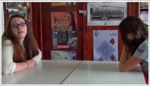
When we started filming the small clip we filmed a person coming through a door and sitting opposite another person then having a conversation.
During this clip we used match on actions, over the shoulder shots, long shots and mid close ups.
 
We found the match on actions difficult to understand because it was difficult to make sure that it was flow properly and not jump. We managed to get it to flow okay but it was still slightly jumpy because we were quite inexperienced.


This match on action in my preliminary task did not go as well as I would have hoped, there was a big jump between actions and did not continue smoothly as I would have liked.


Where as this match on action in my final product is a lot smoother and continues right through, this looks very natural. In comparison to my preliminary task this is a lot better because there is no jump between actions. This shows the progress I have made.


When it came to filming my full product, the filming came a lot more naturally to me because I had had a lot more practise since the preliminary task. I also found taking the camcorder off on our own to film was a lot easier because I didn't feel as nervous around my class or teacher so I felt more confident to experiment and I wasn't worried about making mistakes, this helped me improve a lot and gave me the confidence to want to improve. During filming I made a few mistakes in my shots but this is how I learnt from my mistakes and I learnt to re-film and take multiple shots each time. I learnt about settings, costume and props etc as well as how to use the camcorder. This was very interesting because to make the product look successful you have to have a correct setting and I chose costume and props to look realistic and create the right atmosphere.  


I feel since the preliminary task I have come a long way because I now know how to use a camcorder successfully and I completed my product and I am happy with how it has turned out. I also feel I developed more understanding to different shots and smaller details like setting up in the correct lighting and not to have unwanted objects in the background that may distract the audience. I feel very happy with what I have achieved in the time since the preliminary task.

Team work


In the preliminary task, we worked in a group of 3 with my friends Cassie and Emily. We worked quite well together and got the work done but we did have some difficulties if people did not agree with each others ideas. However when making my final product I worked in a pair with just Emily and we worked very well together! I believe we communicated very well and didn't disagree, we listened to each others ideas and took them on board and worked to out greatest potential. We both worked just as hard as each other and put a great amount of effort in as we wanted the best result we could achieve. I am very happy with how we worked together as I think we made a great team and the work definitely benefitted.
In conclusion I am pleased with how the final product ended up and I couldn't have done it without the co-operation between my and my partner as the work we wanted to complete was done well. We stuck to our plans and the codes and conventions to ensure our film is appropriate.


Wednesday, 6 November 2013

Evaluation- Question Six

What have you learnt about technologies from
 the process of making this product?


Monday, 4 November 2013

Evaluation- Question Four

What would be your audience for you media product?


This is a graph I created myself from my survey that I previously completed, this shows what would have to interest or entice my audience. If they're interested in these aspects I think they would be a suitable audience for my film. This shows me the types of things that are most popular amongst my target audience.


Sunday, 3 November 2013

Evaluation- Question Three


What kind of media institution might
distribute your media product and why?
 
When creating my film, I also decided to research which media institutions may distribute my film. I looked at many different media institutions but some just didn't produce films similar to mine for many reasons such as genre and target audience so I came to the conclusion they wouldn't be interested in my film. However I did find some media institutions from my research that produce films that are very similar to my film. Here is what I found most appropriate:
 
Lionsgate Productions
I think Lionsgate Productions would be the most interested in distributing my film because they distribute a lot of horror films similar to my own. Most of their films they have produced target a similar audience to my target audience around a teenage age/young adult, which made it a lot easier for me to choose them. A large majority of the horror films produced by Lionsgate Productions have been very successful in their genres, they usually make it big and are shown in the cinemas. I aspire my film to be a lot like the films they have produced and I would intend with the help of a media institution it to become very successful.
 
Lionsgate Productions produced many films similar to mine, here are some examples:


The films Texas Chainsaw 3D, The Last Exorcism, Hostel and Saw were all distributed by Lionsgate Productions. These films are similar to my film which is why I chose this as the perfect institution for my film, they were successful and became well known which shows the institution is very good and appropriate. All of these films are the same genre as mine, they're all horrors; some are gory horrors or psychological horrors. I wanted to choose this institution because it suits my film best and a lot of there films are similar to mine and target the same audience. Researching into different institutions has shown me just how many different institutions there are and how competitive this film market is especially when dealing with specific genres. 


Lionsgate pictures have their own social networking site on twitter. Their twitter account has thousands of followers. From researching Lionsgate I came across this blog. Many people interested in their films can look on here and see lots of updates and the type of things they produce. It also shows parts such as the companies interests. Here is a link to their own blog on twitter; 


Saturday, 2 November 2013

Evaluation- Question Two

How does your media product represent particular
social groups?
 
 
I have described the type of person in my text through costume, makeup, body language and the shots I have used and sounds. I planned what sort of person I wanted my main character to be and what I wanted the audience to perceive the character as. I chose for my main character to be a teenager as that is who I'm targeting my film at so I want the audience to be able to relate to my character.


This photo I have taken of my main character, shows her wearing causal clothing like a cropped t-shirt which has a logo and image of iron man on the front which is a popular film amongst teenagers, it is very cool and modern. She is wearing skinny jeans which are attractive but still casual. She has her hair tied up in a pony tail which is a very causal hairstyle but looks very pretty, this is very common amongst teens. I want my main character to look as realistic as possible so my target audience will feel like they can relate to her and understand.


This photo I have taken of my main character shows her body language and gives an insight to her personality because we can see from the photo that she appears to be very confident because of her strong facial expression and her body language as she is stood with her hand on her hip. This confidence and her strong personality will hopefully attract my target audience of teenagers. Also the clothing she is wearing in this photo is quite individual and cool. This will hopefully appeal to teenagers who would be interested in my film.


This photo I have taken of my ghost character shows her wearing old fashioned looking clothing, the top she is wearing is velvet and navy blue with buttons going up the front, the lace cuffed sleeve and the lace collar emphasise the old fashioned look because in the old years, children were expected to dress a lot smarter than children are these days. The character is also wearing a long burgundy velvet skirt down to her ankles, similarly to the top she is wearing it looks very old fashioned and smart. I chose this costume because I wanted it to be obvious to the audience that this young girl is a ghost from a long time before and I wanted her to look very creepy but to look realistic and not too far fetched. You can tell from this image the ghost child is not a happy ghost and looks very serious, the way the child is cocking her head makes you infer that she is dead and it looks scary.


This is the bed that my main character who is a teenager sits on at the very start of my film. This shows what kind of person she is as she has a normal double bed and she sits on it whilst reading a book. I think this will attract my target audience because it shows that my main character is very cultured and isn't just a stereotypical teenager, she also likes reading. I use this shot because it shows the whole character and what sort of environment she lives in, as this shows her own personal bedroom. It gives a clear insight to what the character is really like.


I used different shots to show my characters and represent different social groups because they shows her personality and attributes which could show what a social group is like in general. For example:


This Screenshot shows a part in my film where the main character hears mysterious banging coming from a barn outside the yard. My main character appears very brave and goes to investigate and follows the banging to the barn she then enters the barn. This image shows her when she first hears the banging. The use of a close up shows the clear curiosity on her face, this represents teenagers because they are stereotypically known for being very brave and fearless, some people could interpret this as naivety or bravery.  


This screenshot shows a part in my film where my main character is sitting on her bed in her bedroom reading a book, this shows the audience that she has an intellectual side. From showing her reading a book, people could make the assumption that she is well educated. The use of this long shot, shows her sat like a stereotypical teen cross-legged on her bed, this represents teenagers because she is educated, it shows that teenagers do have a calm, intellectual side to them.


This screenshot shows a part in my film where my main character is stood at her dressing table, getting ready to go out. She is looking through makeup and hair accessories. From showing her getting ready it shows people the film is realistic as this is the type of normal day to day activity a teenage girl would complete. The use of the midshot represents teenagers as most teenage girls enjoy getting ready and going out. They're usually interested in makeup and having fun.

However, choosing a female main character could be interpreted as choosing a weak, vulnerable character. Often in horror films women are stereotyped as vulnerable because they're commonly the character who is caught by the bad character, injured or gets lost etc. They're also viewed as weak because of being easily led by characters such as men, this could be because of being attracted to the opposite sex, the male is stronger than them or they take advantage.

In conclusion, my media text presents a particular social group. I chose to focus on teenage girls, this was because I could relate to it and a female teenage fit the role I wanted because they are brave to an extent but vulnerable enough to become scared by ghostly events. I chose her to be a teenager because she is very modern and up to date which would appeal to my target audience.


Friday, 1 November 2013

Evaluation- Question One

In what ways does your media product use, develop or challenge the conventions of real media products?
 
Before I started making my film, I planned out what I intended to do, for example I planned my storyline of my film by using a storyboard, when I was completing this I also listed the types of shots I thought would be appropriate for a horror film. This planning was helpful because it helped me plan ideas of what follows the conventions of what is expected of a successful horror film. It also showed me if my ideas challenged the usual conventions as I had some individual ideas which aren't as commonly used in horror films.


I have chosen to look at the film The Conjuring (2013) because I think that this film follows some of the conventions which are known to make films successful like my film does. I'm going to show similarities and differences between The Conjuring (2013) and my film opening relating the conventions of a horror film.

Secluded setting


The conjuring is set in quite a remote setting, they do this because the house has a past and they want you to feel nervous about this. Also it makes the film seem eerie because the exorcists and paranormal investigators have to come out to them which makes the home seem like its away from safety and civilisation. This is a common convention to create the scary atmosphere needed for a successful horror film, my film is also set in a remote area because I wanted to have the same atmosphere as it makes the audience feel on edge and it builds up suspense. I used this convention because it is very common and always seems to work to build up tension. Similar to The Conjuring my film is supposed to have a history behind it that needs to be revealed, this is emphasised by using a secluded location. In my opinion I think this is a very successful convention to use as every horror film I have watched where they have used a secluded location, it has made me feel nervous and on edge, I think this is how the audience should feel when watching a good quality horror film. I also think I have developed this convention because the secluded location makes you think that there is no other characters around and that they are on their own, at the start of my film opening I tried to portray the main character as on her own but as the opening unravels the audience soon learn that she is not the only person around and at the very end you see who has been watching the main character and 'haunting' her, this is how I think I develop this convention which a twist of my own.

These images show the similarities between The Conjuring and my film having secluded locations to film in:


This is the setting in The Conjuring (2013). As you can see in the image there is the focal points of the old fashioned house and a noose but you can tell its very secluded as all you can see is trees and mist for the whole background.


 This is the setting in my horror film opening. My setting also has the focal point of the barn and the background only shows trees and nature surrounding the barn.


 Characters

In my horror film opening I used two characters; my main character is a teenage girl called Eliza. I chose to use a teenage girl because it would appeal to my target audience of teenagers. I chose to use a modern teenager who is attractive because this follows the conventions of a successful horror film. My main character is very stereotypical because she plays the victim and is very curious and goes looking for the trouble and supernatural. Similarly The Conjuring (2013) the family has children who are around a teenage age who are haunted by something supernatural and look for the trouble. Having a character or characters who play victims and are bothered by the supernatural but still are curious and look for the danger, is a common convention which makes the audience feel very tense because while the character is being troubled by a spirit the audience are watching and know something is going to happen and have to wait for it which causes them to feel scared and on edge. With this character I think I follow the conventions a successful horror film uses. In my film opening my other character is the supernatural character or ghost. The ghost isn't in my film opening as much as my main character who is in all of it. The ghost is briefly spotted my the audience at the very beginning and then seen again at the end when the audience and main character see the ghost. Although the ghost is only seen briefly there is a lot of paranormal activity which is presumably caused by this ghost. The conjuring also have ghosts which are briefly seen but the activity caused by the ghosts is shown consistently. A common convention is not showing the audience the ghost or spirit because it lets the audiences mind run away with them causing them to have all sorts of thoughts and this causes terror and sacredness, both my film and the conjuring use this technique. Although I do show the ghost briefly multiple times to scare the audience which challenges this convention.

These images show the similarities between The Conjuring and my films ghost:

This is the ghost in The Conjuring (2013), the ghost isn't showed very much through the film so this builds up suspense amongst the audience. The ghost looks very scary so when it is briefly shown it leaves a lasting fear with the audience.


This is the ghost in my film opening, she isn't shown much in my opening either but is shown multiple times. My ghost character looks more natural because I wanted it to look like a young girl from the past who had died as I want it to be realistic and not too far fetched which suits the conventions.


 Storylines

The storyline of my opening is very basic as I did not want the first 2 minutes to be too over powering and to fast moving. At first I have my main character in her room reading she then gets up and goes over to the dressing table, when she moves away from the dressing table the audience see a ghost and as she comes back the ghost is gone. Next she walks outside into the yard and hears banging coming from the barn, once she is in the barn she looks around and cannot see anyone, strange things start happening; the lights flickering, banging noises, a music box starts playing and there is a rocking horse rocking on its own. My storyline follows a lot of common conventions of a horror film. For example, at the very start showing the audience the ghost very briefly is successful because the audience will not be expecting it so soon into film but its not too much that it loses the sense of horror. The banging increases the eeriness of the film as it is all contributing to building up suspense. I did not challenge the conventions I don't think as from my own experience in watching horror films, the films which follow the common conventions when referring to storylines because they always seem to be the most successful horror films and that is what I aspire my film to be like.


This photo from the film Scream 1 (1996) shows a ghost/villain behind the character who hasn't seen it but the audience have seen it in advance. This is similar to how my film opens at the start.


This photo from the film The Conjuring (2013) shows a ghost behind a character and the character does not know about this ghost. However differently another character who is conversing with the man we can see, can also see the ghost behind as well as the audience.

In conclusion for my media product I followed the common conventions of a horror film and used conventions that other films used that were popular. I used some stereotypical horror aspects because they're easy to create and look effective such as having a ghost appear behind a main character. However I did use some uncommon horror conventions, for example I kept my ghost quite natural looking and not too scary or cliché, I challenged this convention because I didn't want my film to appear far fetched.

Saturday, 19 October 2013

Audience Feedback

Audience Feedback
 
 
From the feedback I have been given I have thought about how much dialogue I have. As the opening of my film does not have very many characters for there to be dialogue between, I have included some dialogue when she enters the barn to call out whether there is someone inside the barn. Although this is not much dialogue, I have included some. I found this quite difficult as there was minimal characters. As the feedback tells me, I have used good sounding such  as music which is helpful as we don't have as much dialogue so this music can break the silence and build up suspense for my audience. 


Friday, 18 October 2013

Shooting Schedule

Shooting Schedule
 
 
This shooting schedule shows how long I took to film and what was done and when. This is good for organisation to know deadlines and what needs to be complete. From this I learnt how my shots need to be complete and when I filmed them. It also meant if I needed to re-film some shots I can monitor when I first did them and when I redid them.


Wednesday, 16 October 2013

Test Footage

Test Footage
 
When I was filming the shots my film opening, I filmed some shots which were to test what it would look like. This was very helpful so I could see which ideas worked and which didn't, this saved a lot of time and it meant I could improve shots before I tried to edit my film. This was a good task as it gave me experience and practise.
Here is some footage I filmed:


00165 from Lucy Trigger on Vimeo.        
                                                                                        00197 from Lucy Trigger on Vimeo.


00196 from Lucy Trigger on Vimeo.                           
                                                                                        00205 from Lucy Trigger on Vimeo.


Tuesday, 15 October 2013

Permission for Filming

Permission for Filming
 
I filmed my film at my friend Emily's house. As it wasn't filmed on somewhere I owned, I had to ask for permission to film on her land. To do this I messaged her on a social networking site, I chose facebook because it was quick and very convenient. The image below is a screenshot of her agreeing to let me film at her house and barn.


This image below shows us arranging a time good for both of us to do some filming at her house, this shows that she was very happy for me to film at her property.


Monday, 14 October 2013

Costumes

Costumes
 
Main character:


My main character is wearing a casual 'iron man' cropped t-shirt with plain blue denim skinny jeans. Later into the film she will wear a plain blue coat which is also casual. I chose quite a fashionable outfit which also looks comfortable and casual, I think this is the sort of outfit a usual teenage girl would wear. Wearing a fashionable outfit will hopefully influence my target audience.

I would like my main character to look fashionable but my main focus is so she looks casual, the sort of look that a usual teenage girl would want to look like. I chose her to have her hair up in a pony tail because this looks attractive but is simple and casual. She has left her side fringe down so it isn't all pinned back and this gives a casual look.


I chose my main character to have only eye make up because this isn't over the top. My main look for her is casual, so minimalistic makeup shows this. She doesn't have much face make up because I want it to look realistic and like a normal teenager, the dark eyes gives her an attractive main character look and again will hopefully attract my target audience.


Ghost child character:


The character of the ghost child I have chosen to wear a navy blue blouse-like top, which has a white lace collar and white lace cuff around the sleep, the top is quite heavy but puffy as well. I chose a burgundy velvet skirt which is down to her ankles. This outfit I chose looks very old fashioned which is the look I wanted because she is from the past.


The ghost child characters outfit looks very old fashioned because of the velvet material of the skirt, the collar and cuffs and the long skirt, also the blouse top has a tie at the back which is in a bow which looks very smart and old fashioned.


This photo shows the lace pattern which is on the collar and cuffs, this shows the old fashioned style and how neat it looks.


The ghost child character has her hair tied back with her fringe down, Her hair is tightly pulled back to look smart and old fashioned and it is also in two plaits, I chose plaits because she is young and I think this is a hairstyle which shows her childlike appearance.


I also chose her hair to be tightly tied back and hair sprayed to look particularly neat as I think old fashioned hairstyles were very prim and neat. Using hair spray kept it in place and very neat.


I chose her makeup to be done very pale, I chose a very pale powder to be used as this would make her look ghostlike and gives an eerie look when she is straight faced, it also made her skin look flawless and ghostly. The dark eye makeup exaggerates the dead, ghostly look as she looks serious and quite evil.


I used powder face makeup and powder eye makeup because I didn't want the makeup to be to over the top and I wanted it to look as realistic as a ghost could look as I wanted her to look similar to what this child may have looked like before her 'death'.


From this task I have learnt that the costumes look good and are what I wanted for my film, it has shown me what it will look like when it comes together and that I think I have chosen appropriate ideas for costume.

Props

Props
 
In the opening of my horror film, I only use two props main props which are the rocking horse and the music horse box (Both of which I photographed below). As these are my main props they influence my film a lot and make an impact. I also use other little props but they aren't in the film very long for example: a book, a hairbrush, some makeup, etc. From this task I will learn which props are the most important and key props and which aren't so important. I will also learn what influence they have on the quality of my film.


This rocking horse is an important prop I use because it is the main focus in multiple shots and it creates a very eerie atmosphere, the atmosphere I was trying to create was achieved by using props like this and this has
meant I could get the quality of terror I wanted. I chose to place this prop in the old barn because they compliment each other as they both have an eerie feel and work well together.


 This music box is a very important prop I choose to use because it has its own shot in my opening 2 minutes, this prop is playing when I chose to use a tracking shot to turn all focus to it, its music is the only sound in this shot. The music it plays is a very scary nursery rhyme sounding tune which adds to the horror atmosphere. Also the music box looks quite old and creepy which was the effect I wanted.


From this task I have learnt how important props are and what part they play in a film. I have learnt that they can impact the film dramatically and can change the way a shot looks. They play a big part in creating the right atmosphere to be good quality. I also learnt that even the less important props have their own role and can change the way a shot looks and make it look increasingly better.


Sunday, 13 October 2013

Risk Assessment

Risk Assessment
 
This is a risk assessment about where I will be filming and what the risks may be. 


Location Recce

Location Recce